Every quarter we are proud to bring to you the latest Denver Metro Price Change Maps! This tool is created and developed to give you a clear sense of current real estate trends in each metro Denver neighborhood. For the first time, we can look inside each neighborhood and see what the real estate market looks like at a hyper-local level. This will help you make a better decision whether you are buying, selling or investing.
Central Denver

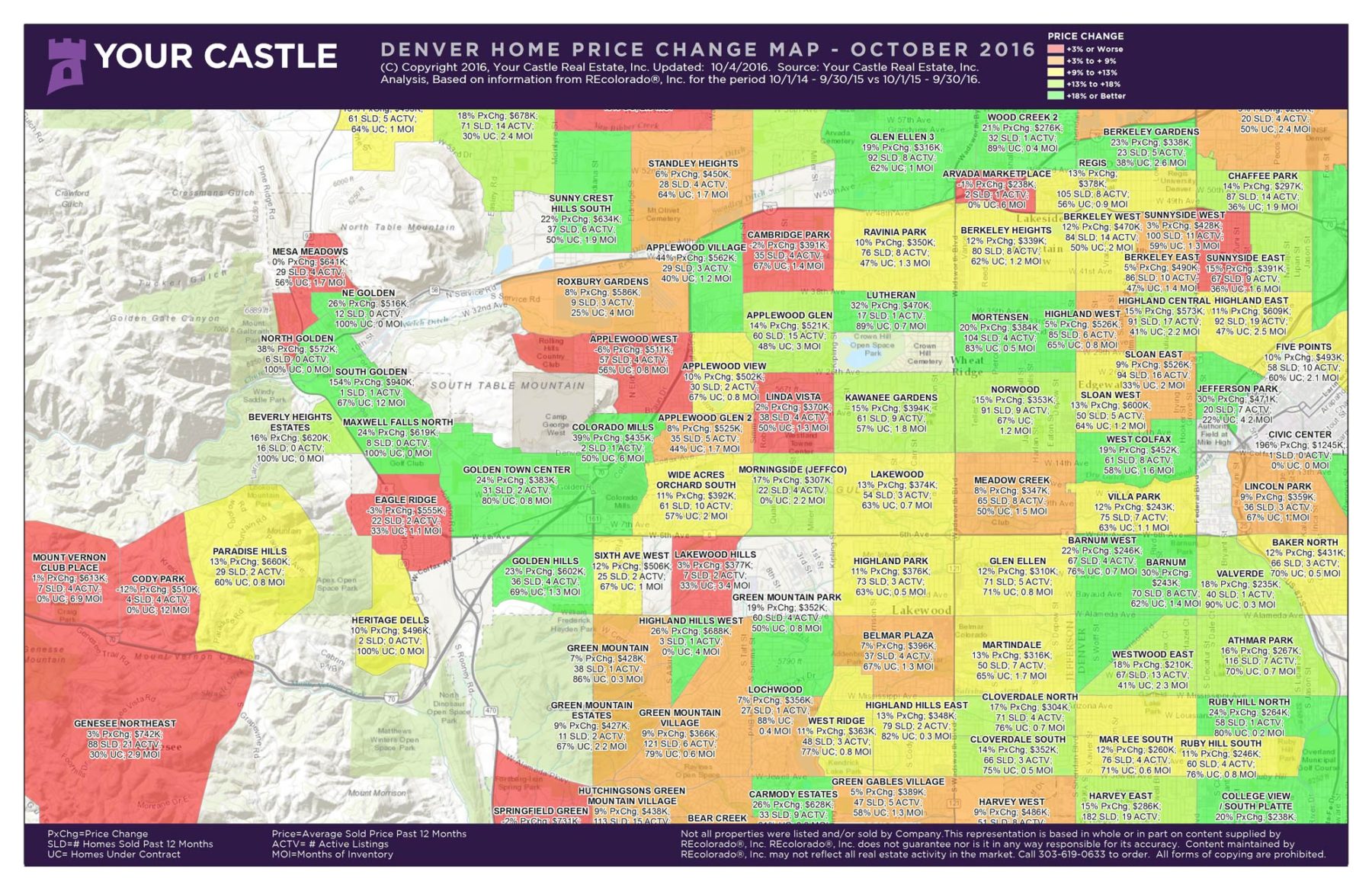
Here’s how to read the map — click on it to enlarge. Pick a neighborhood that interests you, say Five Points. There has been a 10 percent price increase in the past year, and the average sold price was $493,000. There were 58 sales in this time period, and currently there are only 10 active properties for sale. There are only 2.1 Months of Inventory (MOI). What does this tell us about Five Points? It tells us that prices have been rising in the past year due to low Days On Market (DOM) and increasing prices. The inventory is very low which favors sellers. With only 2.1 MOI (6 months of supply is a balanced market) this is a hot neighborhood.
Let’s look at another neighborhood. In Chaffee Park, there has been a 14 percent rise in home prices in the past year. The average sale price is $297,000 and during the previous 12 months there have been 87 sales. Currently there are 14 active properties and there are only 1.9 MOI. What this tells us is that Chaffee Park, like Five Points, is a strong neighborhood with rising prices and low inventory. Below is another map this time showing the West Denver Metro area:
West Denver Metro
Whether you are an investor or just a savvy home buyer, utilizing this info correctly can give you an edge in the market. We have many more maps and are here to help you navigate all of this data so feel free to call or contact us!
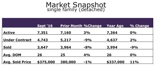
Also, take a look at last month’s Market Snapshot for the Denver Metro area.